HOMIYA CARE
An e-commerce experience for an Indian eco-friendly laundry brand, presenting plastic-free detergent sheets through clear product communication, benefits-led storytelling and a focused purchase journey.
- Type
- Client project
- Industry
- Eco-Friendly Consumer Products
- Year
- 2026
- Focus
- Category adoption
01 — The business problem
You cannot sell a product the visitor cannot picture
Detergent sheets are an unfamiliar product category in India. Before anything can be sold, a visitor has to understand what the product is, how it is used and why it replaces a plastic bottle they already trust.
The category is unfamiliar
Detergent sheets are new to most Indian households. The visitor is not comparing brands — they are deciding whether the format itself works.
The incumbent is trusted
The plastic bottle already does the job. A replacement has to beat a habit, not just a competitor, so doubt is the real objection rather than price.
The design consequence
Comprehension has to arrive before the ask. Every purchase prompt placed ahead of understanding is a prompt the visitor is not yet able to answer.
02 — Visitor psychology
What stops someone ordering something they have never used
The page order mirrors the sequence of doubts a first-time buyer works through. Nothing is sold until the doubt directly above it has been answered.
What even is this?
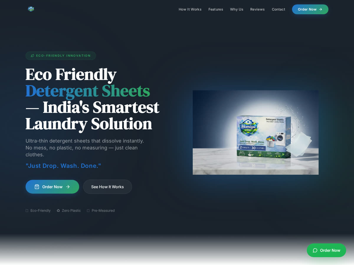
The hero shows the product and states its behaviour in one line — drop, wash, done. Identification has to happen in the first screen or the visitor leaves before any argument reaches them.
Will it actually clean like my detergent?
A short how-it-works sequence explains dissolving and dosing, which is where the real hesitation sits — not in the environmental claim.
Am I paying extra to feel good?
Plastic-free, pre-measured and mess-free are framed as practical everyday benefits, so the value stands even for a buyer who is indifferent to sustainability.
Is this a real brand?
Consistent product photography and restrained presentation carry the trust signal. In an unfamiliar category, looking considered is the credential.
03 — User journey
Understand, then believe, then order
The site leads with the product itself and the phrase that explains it — drop, wash, done — then layers in how it works, what makes it different and the ordering path, so comprehension always precedes the ask.
- 1Recognise
The product, plainly
The first screen answers what it is, not why it is better. Recognition precedes persuasion.
- 2Learn
How it is used
An ordered sequence replaces the mental model of pouring liquid with the mental model of dropping a sheet.
- 3Compare
Why this over the bottle
Benefits are stated against the habit being replaced, in practical terms the buyer can verify at home.
- 4Order
One uninterrupted path
A single Order action stays available once understanding is in place, so the decision does not have to be re-found.
04 — Design decisions
Why this information appears first
Primary
Order
One persistent purchase action. Multiple checkout entry points read as pressure in a category where the visitor is still deciding whether the format works.
Secondary
How it works
The strongest conversion content on the page, placed where the format doubt appears rather than at the bottom as an FAQ.
Tertiary
Sustainability story
Genuine and stated, but positioned as reinforcement — it confirms a decision rather than being asked to make one.
05 — Decisions & tradeoffs
Choices made for comprehension, and their cost
- 01
Explain the format before making any sales argument
A visitor who does not understand the product cannot evaluate a benefit. Education first raises the quality of every claim that follows it.
Trade-off — Returning buyers scroll past explanation they no longer need.
- 02
Frame eco benefits as practical benefits
Pre-measured, mess-free and light to store are reasons that hold for buyers who are not motivated by sustainability, which widens the addressable audience.
Trade-off — The brand reads less activist than eco-first competitors.
- 03
Keep a single ordering path
In an unfamiliar category, competing purchase entry points create a decision about how to buy on top of a decision about whether to buy.
Trade-off — Less opportunity to upsell or bundle at multiple points in the page.
- 04
Let product photography carry credibility
With no category familiarity to lean on, presentation quality is the trust signal. Consistent product imagery does more here than badges or claims.
Trade-off — Imagery quality becomes a hard dependency for future page updates.
06 — Role & contribution
Role & contribution
Client project delivered by Trust Me Studio. Design and build scope only — no sales, conversion or environmental-impact figures are claimed.
Product communication
Explanation strategy for an unfamiliar product category.
Information architecture
Section order from recognition through to order.
UI/UX design
Storefront layout, product framing and purchase path.
Frontend build
Responsive implementation of the storefront.
Launch
Deployment of the live store.
Changes after launch
Products, pricing and copy may have been updated by the brand since launch. Only the scope above is claimed.
07 — Responsive behaviour
Built for a phone in a kitchen, not a desk
1440px
Product imagery and explanation sit side by side, so the format is understood without scrolling.
1024px
How-it-works steps pair two-up while keeping their order legible left to right.
768px
Single column; the explanation sequence stays above the benefit content so comprehension still comes first.
390px
Product imagery is full-bleed and the order action stays within thumb reach through the page.
08 — Outcome
What was delivered
A page that explains an unfamiliar product before asking for the order
Brand presentation that reads considered rather than generic eco-retail
A single, uninterrupted purchase path on mobile and desktop
No sales, conversion or environmental-impact figures are claimed. The statements above describe the delivered build only.
09 — Project gallery
The live store, and what each screen is doing
- What you are seeing
- The live storefront: the product itself, the one-line description of how it behaves, and the single ordering action.
- Why it matters
- This screen has to complete recognition. If a visitor cannot say what the product is after looking at it once, no benefit stated further down the page will land.
- Problem it solves
- It replaces the usual eco-brand opening — a sustainability statement — with product identification, which is the actual barrier in an unfamiliar category.
Want work like this for your project?
Trust Me Studio takes on a small number of projects at a time. If this is the standard you're looking for, start a conversation.