LADAKH TAXI WALA
A travel and taxi booking experience built to help visitors discover Ladakh journeys, vehicles and tour options through a clear, conversion-focused digital experience.
- Type
- Client project
- Industry
- Travel & Tourism
- Year
- 2026
- Focus
- Trip enquiry
01 — The business problem
A trip has to be understood before it can be priced
Travellers planning Ladakh have to compare routes, vehicles, itineraries and durations before they can even ask a price. Most operator sites present that as an undifferentiated wall of text, so the enquiry never starts.
How the category usually presents itself
Operator sites list routes, rates and vehicle names in one undifferentiated block. The traveller cannot tell which option is meant for them, so nobody enquires.
What the operator needed instead
Enquiries that already name a package, a duration or a vehicle, so the first reply can quote rather than start the explanation from scratch.
The design consequence
Discovery had to be structured the way a trip is actually decided — journey first, vehicle second, destination third — with enquiry available at every one of those decision points.
02 — Visitor psychology
What stops someone enquiring about a Ladakh trip
A traveller planning Ladakh is holding several open questions at once and will not send a message until enough of them are closed. The page order follows the sequence those questions appear in, not a marketing sequence.
How many days do I actually need?
Packages lead with nights and days, so duration is answered before any price conversation begins. That is the first filter a traveller applies, so it appears first.
Does this trip cover the places I came for?
Each package names the destinations it includes, which turns an abstract itinerary into something the traveller can check against their own list.
Will the vehicle be comfortable for my group at altitude?
The fleet is presented as its own decision rather than a footnote inside itineraries, because group size and comfort are chosen separately from route.
Is asking going to commit me to anything?
The enquiry is a WhatsApp message, not a form that feels like a booking. Low commitment is what makes the first message happen.
03 — User journey
From inspiration to a message the operator can quote
The site was structured around how a trip is actually chosen: packages first with duration and highlights visible at a glance, then vehicles and destinations, with a WhatsApp enquiry route reachable from every point of interest.
- 1Land
Place before pitch
The first screen establishes that this is a Ladakh specialist. Credibility of place is what a traveller checks before reading anything else.
- 2Shortlist
Packages scanned by duration
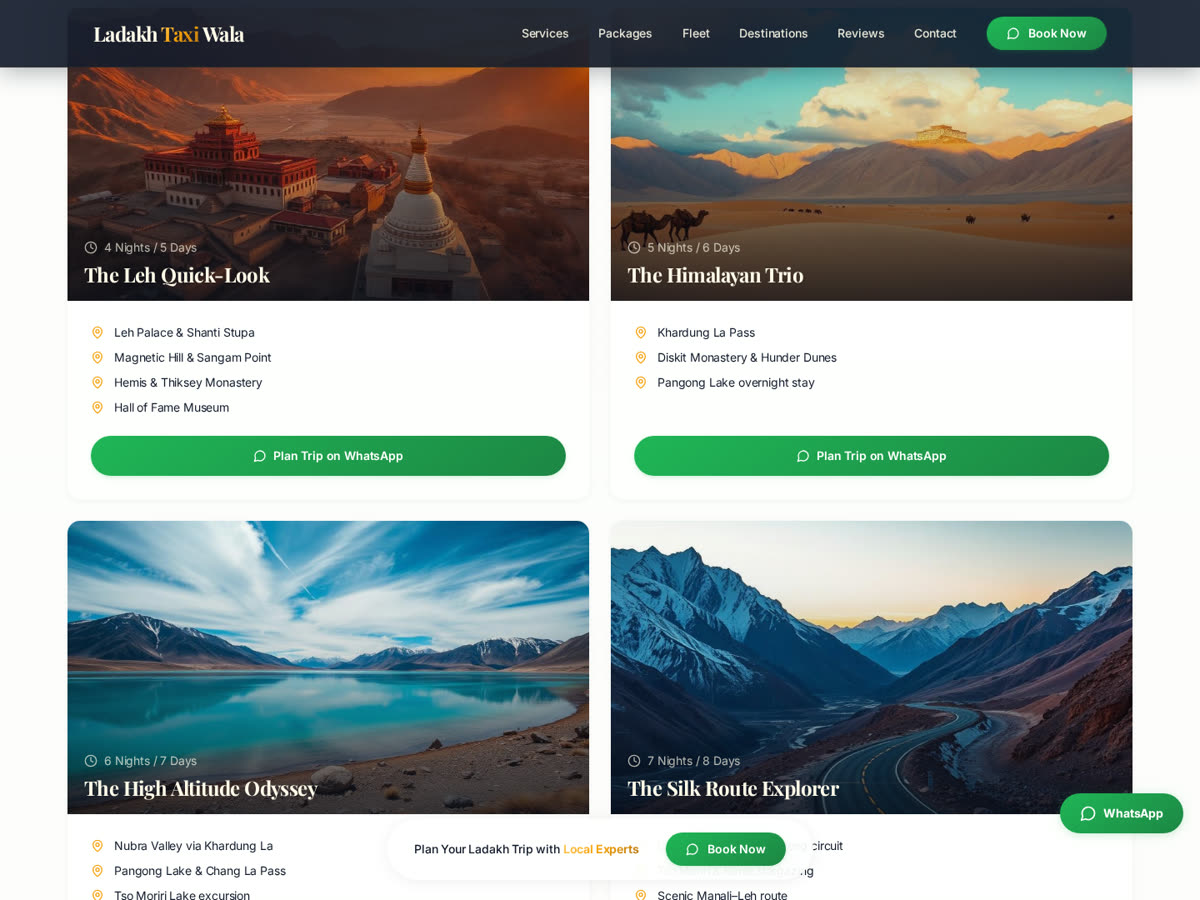
Nights, days and covered destinations sit on the card face so a shortlist forms by scrolling, without opening five detail pages.
- 3Match
Vehicle chosen separately
Fleet options are a parallel decision, so a group travelling together is not forced to re-read itineraries to answer a comfort question.
- 4Enquire
WhatsApp with context
The enquiry starts from the card the traveller was reading, so the operator receives a message with a package already attached to it.
04 — Design decisions
Why this information appears first
Primary
WhatsApp enquiry
The only high-emphasis action. In Indian travel, the operator relationship already lives on WhatsApp — a web form would move the conversation to a channel neither side checks as often.
Secondary
Package and fleet detail
Supports the decision and feeds the enquiry with context, without competing for the tap.
Tertiary
Destination storytelling
Inspiration content sits after the bookable options, because a traveller who is already deciding should not be sent back to browsing.
05 — Decisions & tradeoffs
Choices made for enquiry quality, and their cost
- 01
Make WhatsApp the primary enquiry path
It removes the wait between question and answer, and it is the channel the operator already answers on. A traveller mid-planning gets a reply while still on the page.
Trade-off — No structured enquiry record is captured up front; qualification happens in the first exchange.
- 02
Lead discovery with packages rather than prices
Duration and covered destinations decide fit. Leading with a rate invites comparison before the traveller knows what they are comparing.
Trade-off — Price-first visitors have to enquire to get a number.
- 03
Separate the fleet from the itineraries
Route and vehicle are two different decisions made by two different people in a group. Merging them forces both to read content meant for the other.
Trade-off — Some information is stated twice across the two sections.
- 04
Design for one-handed mobile planning
Trip planning happens on a phone, often in transit or between other tasks. Cards, imagery and the enquiry button are sized for scroll-and-tap, not for reading at a desk.
Trade-off — Desktop inherits a hierarchy derived from mobile rather than the reverse.
06 — Role & contribution
Role & contribution
Client project delivered by Trust Me Studio. Only design and build scope is claimed — no booking, revenue or traffic results are reported.
Product strategy
Discovery and enquiry journey for packages, fleet and destinations.
Information architecture
Section order and card content model.
UI/UX design
Layout, package presentation and enquiry placement.
Frontend build
Responsive implementation of the site.
Launch
Deployment of the live build.
Changes after launch
Content, pricing and listings may have been updated by the operator since launch. Only the scope above is claimed.
07 — Responsive behaviour
Built for planning on the move
1440px
Packages sit three-up with duration and destinations still readable at a glance; a single enquiry action remains dominant.
1024px
Two-up package cards; the fleet section keeps vehicle imagery large enough to judge comfort.
768px
Single column; destination content collapses below the bookable options rather than above them.
390px
Thumb-reach enquiry on every card, with tap targets sized for use outdoors and on the move.
08 — Outcome
What was delivered
A single, obvious enquiry path from any package, vehicle or destination
Trip options readable at a glance instead of buried in paragraphs
A mobile experience built for planning on the move
No booking volume, enquiry count or revenue figure is claimed. The statements above describe what the delivered build does.
09 — Project gallery
The live site, and what each screen is doing
- What you are seeing
- The package discovery section of the live site: each journey card carries its duration, the destinations covered and its own enquiry action.
- Why it matters
- This is the screen where the shortlist forms. If a traveller cannot compare two journeys without opening them, the comparison stops and so does the enquiry.
- Problem it solves
- It replaces the wall of route text typical of operator sites with a scannable set of decisions, and keeps the enquiry attached to whichever journey was being read.
Want work like this for your project?
Trust Me Studio takes on a small number of projects at a time. If this is the standard you're looking for, start a conversation.